Projects / Urban Outfitters
Product Page Redesign, UO case study
Background
Around the time I began working at Urban Outfitters, the company's values were shifting.
Urban Outfitters was known for being a "hipster" brand, but the hipster customer was growing up. They wanted high quality goods in a more refined style. To meet these expectations, Urban Outfitters took steps to elevate its product offering and its shopping experience. Each department rose to this challenge in its own way—the product development team began sourcing better materials with quality construction; the photography department rebuilt its photo studio to shoot lifestyle imagery instead of straight studio shots (more of this and less of this). The company wasn't just selling products, they were striving to sell a whole lifestyle.
Over the course of my time at Urban Outfitters, I did my part to elevate the online shopping experience and showcase the brand's new voice. The product page was an important piece of that experience.
The Prompt
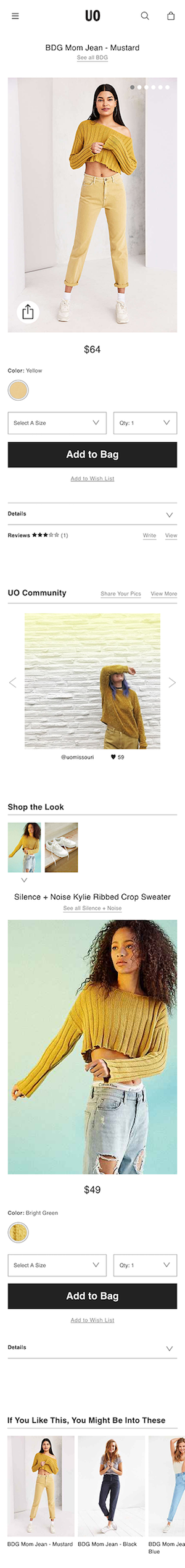
The initial prompt was to redesign the product page and elevate the product. In order to do this, I began by analyzing how it was performing.
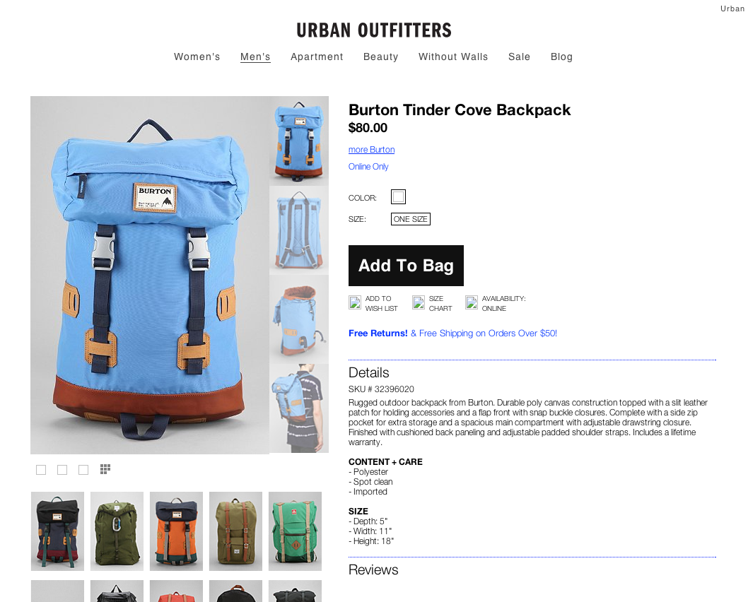
Prior design of the product page.
Analytics had been tracking key metrics on the product page for quite some time. They tracked metrics like the average number of products each visitor added to their bag, and the percentage of people who visited the website that ended up checking out (this is called "conversion"). None of these factors were solely due to the design of the product page, so these metrics served as a baseline to test against later.
The next thing I wanted to know was how the product page could give customers a better understanding of the product. What did customers want to know that they may not learn from the current design? Call center representatives told me that customers' main questions were about fit, quality, and styling ("What else is the model in that photo wearing?").
Next, I considered ways that the product page could support the work of other departments. As I mentioned earlier, the photography department overhauled their studio to shoot beautiful new lifestyle shots. In addition, the social media team was building an incredible community on Instagram by encouraging customers to share their style. Both of these initiatives posed opportunities for the product page.
Goals
All of the factors above contributed to a set of goals for the product page. Urban Outfitters ran an agile shop, so some of these goals were met in later releases after the intial design had shipped.
- Emphasize photography.
- Increase conversion.
- Showcase the Instagram community.
- Let customers "shop the look".
Solutions
During my time as a Product Manager & interaction designer, I developed a process to ship products with Creative, Engineering, and Analytics. You can read about that process below. For the sake of brevity, I'll focus on outcomes in this case study.
Goal #1: Emphasize photography.
A picture is worth a thousand words. I wanted to answer customers' questions about fit and quality with the big, detailed lifestyle images that the photo studio was shooting.
But as soon as you say you want big and detailed images, developers rightly put their palms to their faces. Page load times are significantly impacted by large images, and customers are shown to drop off exponentially with each second that passes. In addition, every byte that we send to a customer results in costs to the company. I needed to implement a design that would minimize page weight by serving large images only when needed.
After iterating through a few concepts, I landed on an image grid layout. On initial page load, the grid would display thumbnails of all of the product images. If a customer clicks on a thumbnail, it would fill the entire space. From there, customers could page through large images, or click again to return to the image grid.
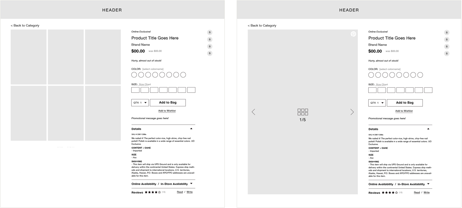
The image grid on page load (left) and upon click (right).
This solution communicates a lot of detail with minimal page weight. The lightweight thumbnails in the image grid load quickly and give customers an immediate 360-degree view of the product.
If a customer clicks to view an image, a large image is only requested at that moment. This means that if the user decides to leave without interacting with the image grid, then the data from bigger images is spared.
Furthermore, we felt that the large images in the new design were high-enough detail that a zoom image was no longer necessary. In the past, big and expensive zoom images were available when the user hovered a smaller image, but it only gave customers a tiny frame to look through. The new image viewer would give users whole, large images at a fraction of the size of zoom images.
Live image grid
On mobile, we opted to show each image one at a time and load only the adjacent images to the current one. This gave mobile users more detail with less data.
Goal #2: Increase conversion.
Simply put—we wanted to sell more things! We understood that a new design alone wouldn't convince everyone to purchase every product, but we hoped to move the needle by subtlely nudging customers to check out.
In the previous product page design, customers that added a product to their bag were confronted with a full-page modal confirming that the product was indeed added. The modal was providing valuable feedback, but perhaps too much feedback—the modal was impeding customers' ability to keep shopping.
Here is the new design:
The new add-to-bag component doesn't get in the way, but it gives users the option to check out immediately and points to the place where they can check out anytime.
Goal #3: Showcase the Instagram community.
The Urban Outfitters community is filled with fashion lovers from all walks of life. The UO brand is based on individuality, so the company partnered with Curalate to showcase user-generated content straight from the community.
Here's how it works—when an instagram post includes one of UO's hashtags, it gets pulled into a feed that the social media team reviews every morning. The team tags Urban Outfitters' products in each post approves them to appear in the "UO Community" gallery. In the gallery, you can browse images and shop directly from each post.
Since the association between products and posts was already established, we added user-generated content to the product page.
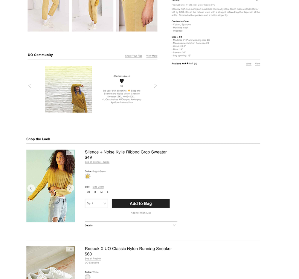
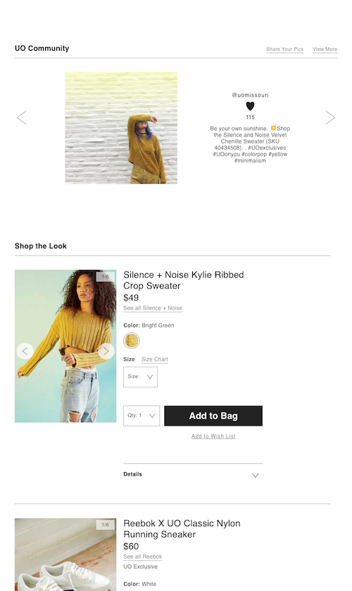
The new product page integrates UO Community by pulling in every post that features the current product. This allows past customers to show off their personal style, and helps prospective shoppers picture how they might wear the item. In a future release, we hoped to allow customers to inspect each post and shop the other products in the shot.
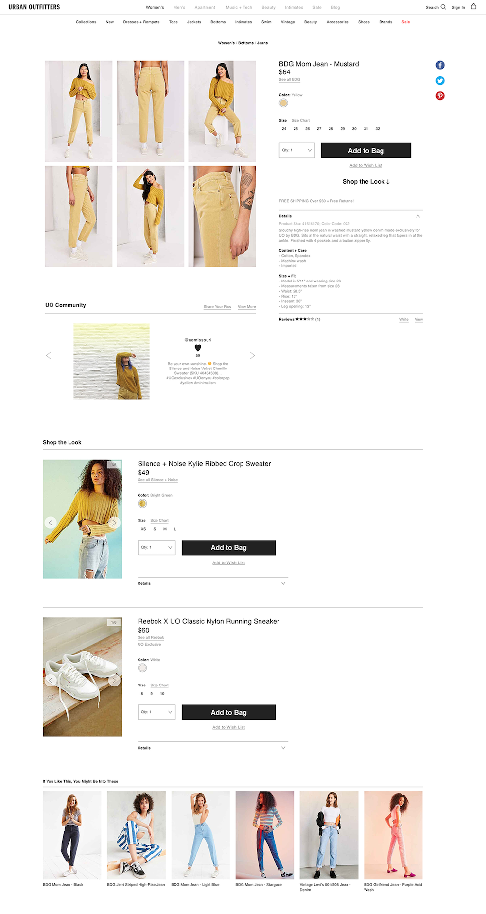
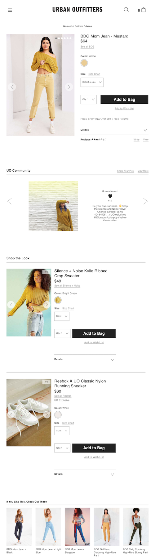
Goal #4: Let customers "shop the look".
As we found out from call center representatives, customers want styling help! Luckily, the team was shooting lifestyle photography full of beautifully styled outfits, so we wanted to allow customers to shop the entire look in each photo.
I worked with the web merchandising team to understand how we could associate products together using the tools they already had. The back-office system had the ability to do this, and it was easy to expose that data to the newly rebuilt product page. We decided that each week when new products were added to the catalogue, the web merchants would tag the items that models are wearing in the most marketed products. These items appear in a "Shop the Look" tray below the main product.
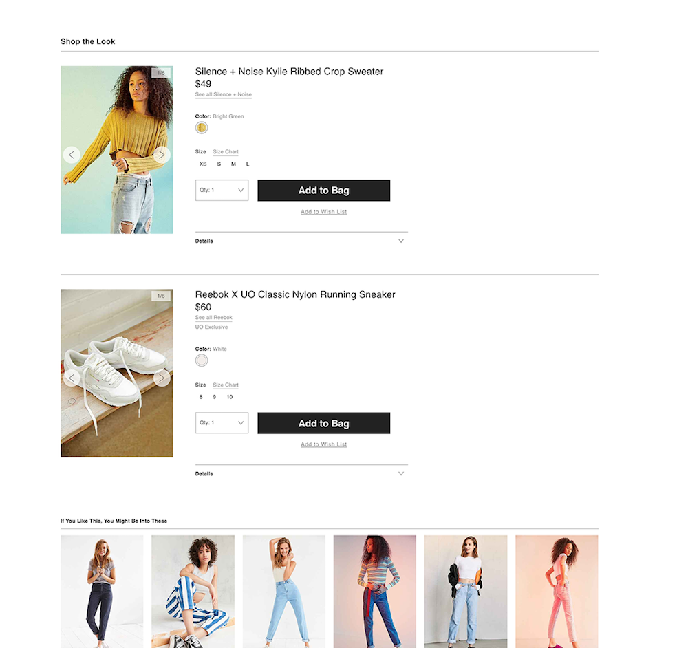
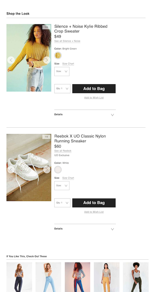
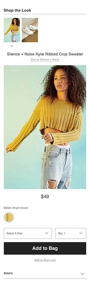
Due to the business's excitement for "shop the look", our biggest challenge was limiting how many outfits the web merchandisers had to tag every week! Over time, the new process found its pace and today you can "shop the look" on many products.
Final Product & Results
The new product page resulted in less items added to bag but an overall higher conversion rate.
In other words, less people added items to their bag and left the site before checking out, and more customers who added items to their bag continued to purchase.
My team's hypothesis for this change was that the new image grid provided enough visual detail to help customers decide whether or not to purchase. My super unscientific way of describing this phenomenon is "confident bagging"—meaning that people that added items to their bag did so with the intention to purchase.
However, at the time, Urban Outfitters did not have a survey tool or a way to reach out to customers to validate that hypothesis. With more tools and a direct line to customers, I would have conducted interviews to understand motives during check-out, and studied product return rates and reasons to see if the new product page did a better job of representing the actual product.
My role @ Urban Outfitters
Product development at Urban Outfitters was a collaboration between Creative, Engineering, Analytics, and my Product Management/UX team.
New projects came from strategic objectives that were defined at the executive level and handed down to my team to develop into features. As a product manager and UX designer, I would begin by defining goals with various stakeholders, then iterate on ideas, and finally produce wireframes and product requirements.
Then, I would hand the wireframes and requirements to Creative for visual specs, and Engineering to build the feature's framework. When Creative was finished with design specs, Engineering would apply these styles to the framework they'd built. Before the product was finished, I would work with Analytics to define KPIs that would measure the success of our original goals. Analytics would translate these KPIs into tracking requirements that Engineering would implement and ship with the feature.
This is a process that I refined and oversaw during my time at Urban Outfitters. It helped all of the teams work closely together to ship and iterate on features.