Projects / Urban Outfitters
Taxonomy & Navigation Redesign, UO case study
Background
Urban Outfitters' product catalogue was diversifying and deepening.
The company was buying and producing a wider range of products, and simultaneously expanding the product offering within every category. This meant that in addition to adding new products (ie. Kimonos), they wanted to expose more varieties of each product (ie. Midi, mini, and maxi skirts).
Our team needed to find ways to allow customers to easily traverse this wider and deeper product catalogue.
The Prompt
At its core, this was an information architecture challenge. On top of that, the website's navigation couldn't support more than one level of categorization. The team that added new products to the website each week were pressured to add every new type of product directly into the navigation.
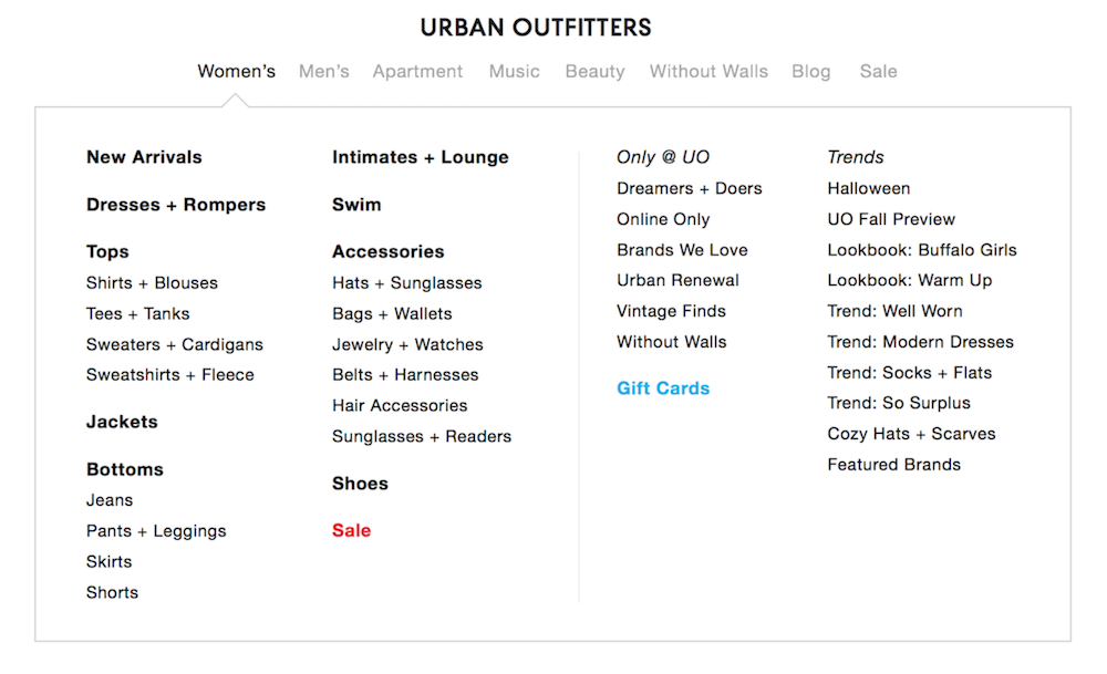
These factors contributed to what I later called the "Mega Nav", a big drawer of links that a user would encounter when they hovered on a top level vertical like Women's.
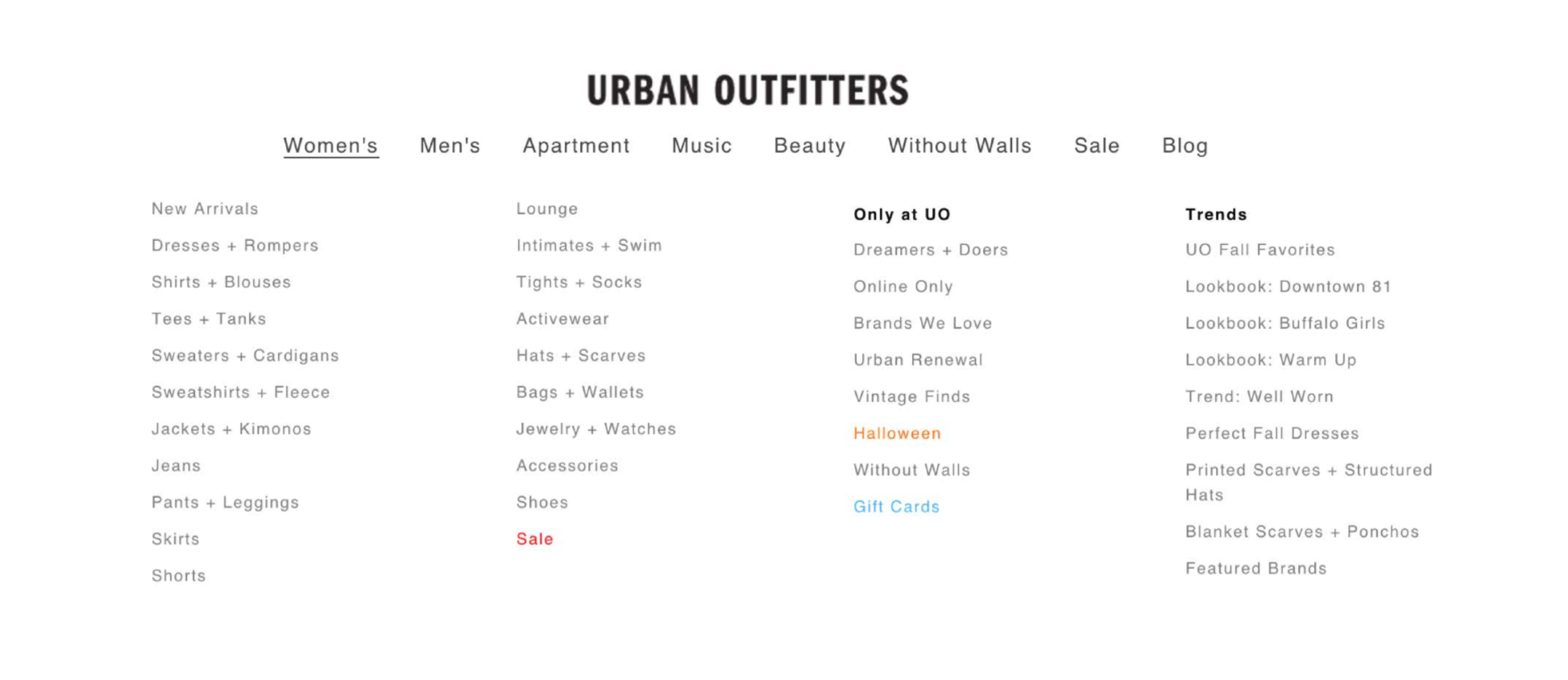
Prior navigation and taxonomy (ie. Mega Nav).
You'll also notice that the navigation was being treated as a marketing tool. It showed as many product categories as it did weekly trends and exclusives.
The reason for this marketing focus was that the brand invested heavily in its weekly campaigns and most customers would rarely see them. These campaigns lived on "gateway pages" that could be accessed by clicking a top level vertical like Women's. But hovering comes before clicking, and the Mega Nav would appear and drive customers into product categories without ever reaching a gateway page.
Links to weekly trends and exclusives were added into the navigation as an attempt to gain exposure, but the result was an overwhelming tray of links that harmed the user experience. We needed a better way to expose products and stories in the most appropriate and understandable way.
Goals
- Create a simple, logical taxonomy.
- Support all types of shopping.
- Promote weekly campaigns.
Defining a Taxonomy
The first step was to define a new taxonomy that shoppers would understand. This began by defining product categories—something that Urban Outfitters was clearly missing.
In order to define categories, I began by running a series of remote open card sorts through Optimal Workshop. I worked with web merchandisers from each vertical (Men's, Women's, Apartment, Music, and Beauty) to choose ~40 products that best represented the product range in each department. Then, I chose one image of each product that most clearly represented what it was. Participants were asked to sort these images into groups and give each group a name.
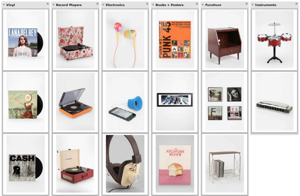
An open card sort for the Music department, in progress.
I sorted through the results to find common names or intentions and come up with a proposed taxonomy for each department, which I reviewed with the web merchandisers in each department.
Next, I tested the new and old taxonomies in remote tree tests through Optimal Workshop. A new set of participants were shown a series of images and asked where they might find each one in the navigation. This allowed me to compare how quickly and directly customers could discover items in the new taxonomy vs the old.
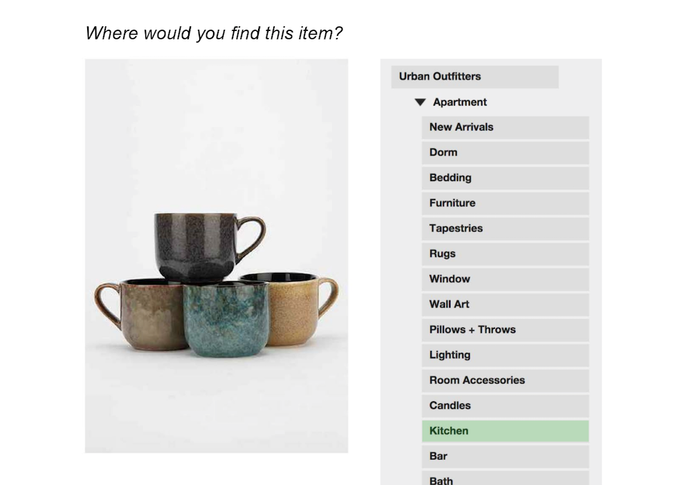
A tree test in progress.
Results
On average, participants chose the correct category of an item ~12% more often in the new taxonomy than they did in the previous one.
The departments that benefited most from the heirarchy in the new taxonomy were Women's and Men's, where top-level categories like Tops and Bottoms were fairly universally understood. However, departments like Apartment did not benefit as much, seeing some products drop significantly in discoverability. This was an important thing to consider when we designed the new navigation.
Individuals in each study were invited to participate if they had recently used the website and fit within the demographic for each study (For example: Only female respondents could take the Women's card sort).
Designing the Navigation
While the taxonomy was being perfected in a shared Google doc between web merchandisers, buyers, and product developers, I set to work on the design of the new navigation. It would need to support three tiers of categorization, and three types of shoppers.
Three Tiers of Categories
The new taxonomy contained 3 levels of heirarchy in each department: top-level categories, sub-categories, and styles. The spreadsheet below shows the top level categories in grey, the sub-categories listed beneath them, and the number of styles within each sub-category denoted by a number.
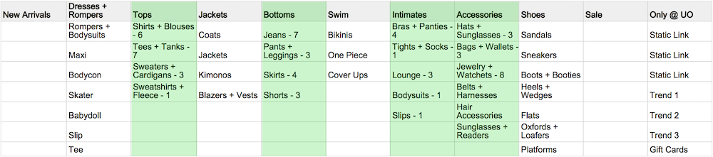
A draft of the Women's taxonomy (don't mind the green).
Three Types of Shoppers
In addition to supporting a new heirarchy, the new navigation needed to support these key types of customers:
- Targeted shoppers: Customers that know exactly what type of product they want.
- Browsing shoppers: Customers that have an idea of what they're looking for (ie. A dress), but they aren't sure exactly what kind of product they want (ie. A shift dress).
- Inspirational shoppers: Customers without a product in mind, who come to Urban Outfitters for shopping inspiration. This type of customer might be referred to as a "window shopper" in traditional retail. They find inspiration in our weekly campaigns and purchase into a trend or lifestyle.
These considerations led to many wireframes which were narrowed into two main concepts. The examples here will focus on the desktop experience because it was responsible the overwhelming majority of sales.
Concept 1: Improved Mega Nav
Considering that the product assortment in some departments didn't fold nicely into a limited set of categories, this navigation was a safe choice. This navigation allowed some departments to use as many top-level categories as they wanted. In addition, this design would handle translations well and expand as needed.
However, this navigation had similar problems as the original Mega Nav, where it allowed possibly of perhaps too many top-level categories. Without oversight, this navigation might stumble into the same pitfalls as the last one. Furthermore, this navigation would defer users away from the gateway pages just as the legacy navigation had.
Concept 2: Consolidated Nav
This navigation was designed with the intent of driving more customers to gateway pages before exploring categories.
Customers that arrive at the homepage must first click on a department link (ie. Women's) to begin shopping. Once within a department, categories are displayed directly on the page. Shoppers can browse top-level categories (ie. Tops), or skip directly to a specific type of product through sub-category dropdowns (ie. Tees). This satisfied our three types of shoppers.
This navigation also helps orient customers that are deep within the catalogue. The navigation highlights the current department and category to help users retrace their steps, and to help users that enter the site through category or product pages find their place.
The decision to prevent users from hovering on a department to go directly to products sparked a long debate. Some thought that forcing users to click into gateways would make them leave the site. On the other hand, exposing the gateway pages was a high priority. To help make this decision, I prototyped two versions of the nav—one with a hover state, and one without. The prototype uncovered a usability issue, below, which helped us decide to ship the non-hover nav.

When moving between department links (above) and categories (below), it's easy to accidentally hover on another department on the way to the category.
The team decided to move forward with this design, and it shipped on our US site in the Fall of 2014. After it was proven to work in our North American markets, I worked with our international teams to define taxonomies for our 3 international markets.
Final Product & Results
After the new navigation was launched, the number of categories viewed per session increased, and gateways recieved 26% more traffic.
In addition, the new navigation was good for SEO. Categories gained higher ranks over time and more sub-categories were available to be indexed by search engines.
My role @ Urban Outfitters
Product development at Urban Outfitters was a collaboration between Creative, Engineering, Analytics, and my Product Management/UX team.
New projects came from strategic objectives that were defined at the executive level and handed down to my team to develop into features. As a product manager and UX designer, I would begin by defining goals with various stakeholders, then iterate on ideas, and finally produce wireframes and product requirements.
Then, I would hand the wireframes and requirements to Creative for visual specs, and Engineering to build the feature's framework. When Creative was finished with design specs, Engineering would apply these styles to the framework they'd built. Before the product was finished, I would work with Analytics to define KPIs that would measure the success of our original goals. Analytics would translate these KPIs into tracking requirements that Engineering would implement and ship with the feature.
This is a process that I refined and oversaw during my time at Urban Outfitters. It helped all of the teams work closely together to ship and iterate on features.